

Service Operations Dashboard
At any one time, there are thousands of Rivian vehicles waiting for service. These vehicles will typically have a complicated network of issues and paperwork, all with associated SLA requirements. This makes it very hard for our Service Operations teams to prioritize what work to do next. Our teams needed a way to streamline their working cadence and ensure that the most important issues are addressed first, and all issues are addressed in a timely manner.
Project Details
Length: 4 Months
My Role: Senior Product Designer
Platforms: Desktop Web
Understanding the Problem
When a Rivian vehicle needs service, typically 3 different types of paperwork / digital containers are created:


These 3 containers of information are all used to accomplish different workflows. For example, Scheduling is done using the Work Order, Photos and other media are uploaded to the Service Ticket, and Remote Diagnostics are performed on the Service Request. As Rivian continues to ramp production and scale deliveries, the amount of data that was being created was becoming overwhelming. This was causing important service data to slip through the cracks. For example, some customers would go weeks without a phone call because Rivian simply lost their service ticket.
Previous Solution


To illustrate the problem, here was the existing solution before Service Operations Dashboard. Basically, just 3 giant tables of Tickets, Requests, and Work Orders, sorted by most recent. While this works well for small amounts of data, we found that it started to get unwieldy very quickly. For example, here are just some examples of things Service Leadership wanted to keep track of:
Customers with high service count. Vehicles that are at risk of Lemon Laws in their respective states.
Customers marked as High Tough, I.e. influencers, YouTubers, investors, etc.
Tickets marked as “open” that have gone more than 48hrs since we have updated the customer.
And many more. However, users had no way to track items with these characteristics in RivianOS, as all they had to work with was one big table.
First Idea: Metrics and Dashboards 📊


My first idea to solve this problem was to create a system of dashboards that would show the overall ‘health’ of the business. My idea was to show how many tickets appeared to be stalled, how many mobile tickets were awaiting service requests, and the average output of the team over time. This would give the Service Operations leadership key insights and metrics to help them prioritize where to spend their time problem-solving. However, when I showed this idea to our user base, they hated it! This approach was too high level and didn’t give them any actionable things they could do to improve these numbers. Basically, they already knew they were falling behind, they needed our help to tell them how to catch up.
Next Iteration: Queues and new modes of working 📌


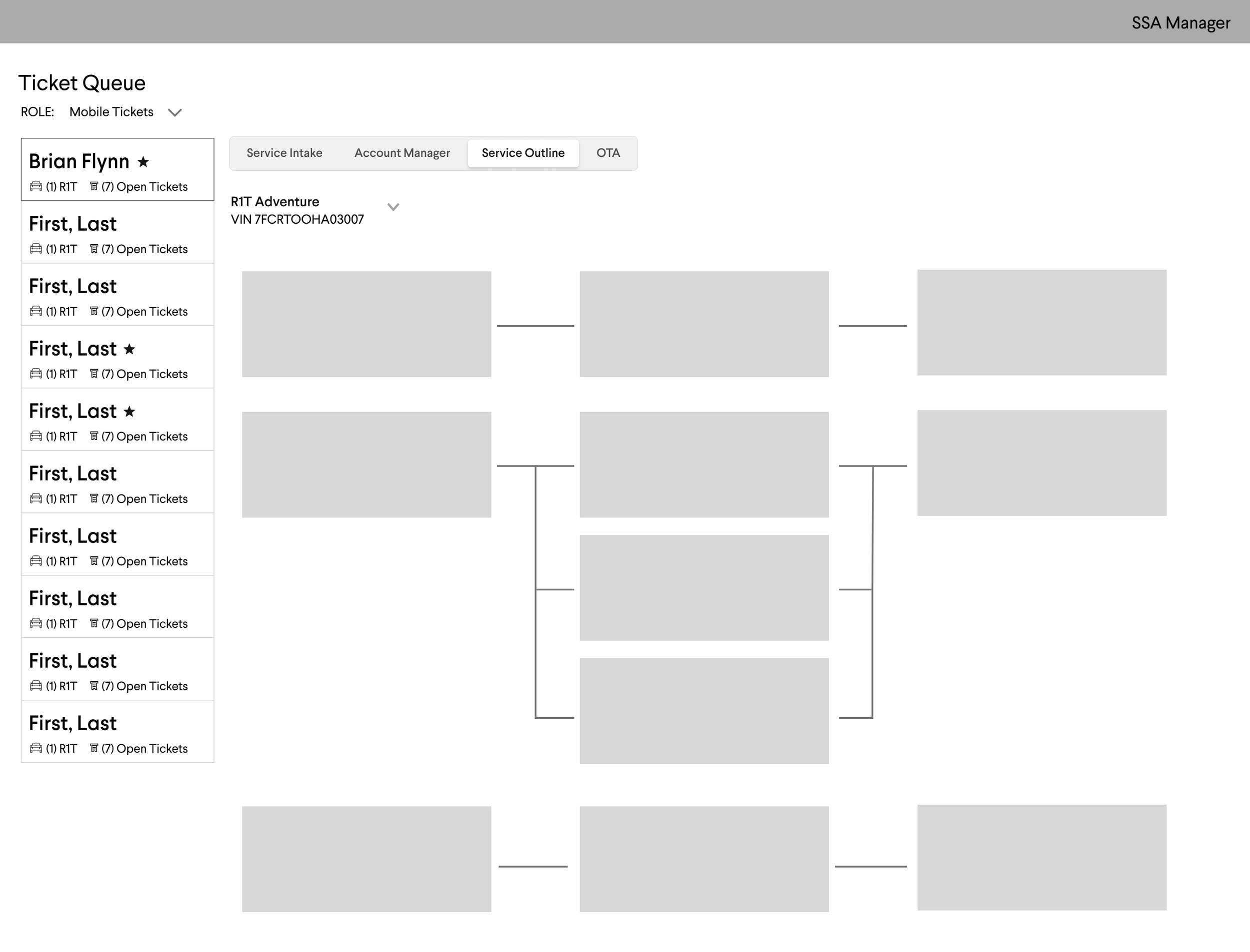
Next, I took a step back and analyzed how users solve service tickets. After shadowing Service Support Advisors in our call centers, I found that they were often switching between a set number of tools. They would often open our Service Intake tools to create new Service Requests, Account Manager to check notes and other user-level information, Service Outline to see service history and finally, OTA to track what over-the-air updates this customer has received. After realizing how common this use pattern was, I decided to design a “Ticket Queue” mode, which would allow users to view all of these tools on 1 single screen. Unfortunately, this idea wasn’t very popular with the Service Support Advisors, as they wanted to view all their content in separate tabs to maximize all the screen space. However, this idea was very popular with our Diagnostics team! While ultimately a data grid with actionable ‘buckets’ turned out to be the best approach for the service support advisors, we were able to leverage this line of thinking for the diagnostics tab.
Solution: Service Operations Dashboard


We have finally arrived at our final solution! Ultimately we ended up creating 3 different tabs, one for each of our main user groups. For the Service Support Operations Center and Field Services tabs, we utilized a buckets and grids approach. With collaboration with our users and leadership, we defined certain buckets of data that would allow them to find and prioritize important items. For example, one bucket on the SSOC tab is “High Risk Tickets”, a collection of service tickets that are either from High Touch customers, contain a repeat service issue, or contain a VIN with > 100 service requests since delivery.
For the Diagnostics tab, we utilized the Queue approach to highlight which VINs were awaiting remote diagnostics support. This allowed these users to provide that support for all outstanding Service Requests on a VIN, their preferred way of working but something that was impossible before this product was released.
Feature Highlight: The Monte Carlo Scheme 🎰


One feature I would love to highlight is the Priority Matrix, affectionately nicknamed the Monte Carlo Scheme™️ . After working closely with the diagnostics team on this project, I noticed that they often referenced a very complicated matrix of values that management defined. This matrix defined which VINs the diagnostics specialists should work on next, taking into consideration things such as how long until the service appointment, whether it is labeled a “Noise, Vibration, Harshness” issue, whether or not it has been escalated, etc. This ranking was all done manually by the Diagnostics team leadership and required extreme levels of effort to maintain. So much effort, in fact, that the general manager of this team hadn’t taken a significant vacation since he started, because he had to maintain this list!
The Monte Carlo scheme was a way to digitize this manual process. Inspired by card counting in casinos, the priority column would assign each VIN a base value of 0. Then, it would compare the service requests awaiting diagnostics support with the priority matrix and add or remove points accordingly. Then, the diagnostics tab would always be sorted by this priority number and visible as the first column. By crafting this matrix in collaboration with the diagnostics team, we were able to ensure that the highest risk and most important VINs would always be the top priority, all without any human intervention.
Results and Impact
The SSOC and Field tabs of the Service Operations Dashboard were successfully launched in Q4 2022. As the diagnostics tab is going to take more development effort, it is slated for a launch date in Q2 of 2023. While it is hard to say how well-embedded this tool has become as it has been released so recently, we expect it to be an integral part of the 130+ Vehicle Services org at Rivian in the near future.